Saturday, May 16, 2009

(35) Comments

New York Mets Uniform Survey Part 2

SS

The next section of the survey is all about uniform choices.


I pick neither black.


Here I went traditional, although the one on the left is fine.


This is interesting.  It doesn't come across well here, but on the survey the one on the right looks charcoal-ish.  You may recall there was a rumor of charcoal uniforms over the spring.   These also unfortunately have black shading.   Vote left.


Since we are not the Denver Broncos I picked neither.   Either of these are better than black, but underarm colors remind me of warm up jerseys.


I went right.


16.  Should the Mets name the bridge in Center Field at Citi Field?  Yes/No/No opinion.

I find that question interesting because that too has been a topic on the blogs.   This really makes me think that the Mets are paying attention to the fans.  Maybe all this stuff works?

I assume the quiz would branch off, here - I answered yes and got the next question:

17.  What do you think the bridge should be named?
a)  Amazin' Alley (wow thats awful)
b) Casey's Crossing (corny)
c)  Gil Hodges Bridge (I like the idea but there already is a Gil Hodgers bridge)
d)  Miracle Mile Bridge (are they opening some strip malls?)
e)  Piazza Path (let's calm down with the Piazza thing, and I'd be afraid of this because, well, deep down you know)
f)  Seaver Bridge (sure)
g) Ya Gotaa Believe Bridge (what, no option for Catch The Rising Stars Bridge?)
h)  Other

I went with Seaver.

18.  Do you have any other comments regarding the Mets uniforms and/or Citi Field?

Y'all can imagine what I mentioned (nicely).

Some thoughts about the survey in a post later today, and if you missed Part 1 of the NY Mets Uniform Survey click here.
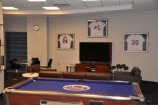
www.metspolice.com
@metspolice
35 Responses to "New York Mets Uniform Survey Part 2"
Damon (METS Fan in Germany) said :
May 18, 2009 at 1:19 AM
The black Jerseys are the best looking ones they have.They should adopt an Orange Jersey. Would be good for night games as well. Besides...they play better when they wear the Black Jerseys

METSFAN4LIFE...Keep Hope Alive!!
Anonymous said :
May 18, 2009 at 1:59 PM
Regarding the bridge in center, i suggested they knock it down and build a new one that looks like the one on the logo.
Anonymous said :
May 19, 2009 at 12:44 AM
jeeez Damon! you're in f***in germany!!! we're trying to get rid of the black jerseys! no orange jerseys no black jerseys - no black at all ... white pinstripes only at home and greys on the road - ONLY blue hats home and away ... damon leave this stuff up to the mets fans here in the states
MikeChuk21 said :
May 19, 2009 at 4:37 PM
I'm guessing that charcoal uniform is an off-white, like what San Francisco wears at home. Works with the Giants' color scheme but not with ours, I think.
MikeChuk21 said :
May 19, 2009 at 4:39 PM
Also, why no black highlights-free option on the home pinstripe jerseys? I've been boycotting buying Mets jerseys for 11 years because you can't buy anything but a '69 or racing-stripe throwback without the black highlights...
Anonymous said :
May 20, 2009 at 3:18 PM
KEEP IT SIMPLE PIN STRIPES METS WITH BLUE HAT AT HOME. ON THE ROAD AND GRAY WITH NEW YORK AND THE BLACK/BLUE HAT ON THE ROAD.
AS FAR AS THE BRIDGE CALL IT THE SHORT FALL BRIDGE , WERE PRETTY GOOD WITH TAHT.
I BEEN A METS FAN FOR 40 YEARS AND LOVE IT.
Anonymous said :
May 20, 2009 at 8:14 PM
NOOOOO black socks or black and blue hat
Anonymous said :
May 23, 2009 at 1:08 AM
Paint the bridge Orange and Blue with some fancy lighting and call it the Shea Bridge, bridging Citi Field to OUR past at Shea....and obviously in honor of Mr. Shea who was crucial in the existence of our Mets!
Zooomabooma said :
May 28, 2009 at 3:00 PM
Some not very inventive people came up with a few of the bridge names.

Amazin' Alley - Casey's Crossing - Piazza Path

Alliteration should be avoided at all costs. It comes off as corny.
Connie Sewer said :
May 29, 2009 at 3:00 PM
Whatever they do, they have to name it after an older met - especially to quell the gripes from the #42 naysayers (the folks saying crap like, "Robinson wasn't even a met"). Hodges is good since his number is retired (hodges crossing?). I think in keeping with the historical nature of the stadium, the older the player, the better.
June 5, 2009 at 3:45 PM
I like the idea of Heilman Bridges Falling Down

but seriously...

Kiner Crossing
Mike said :
June 6, 2009 at 2:26 AM
Original button up stile all the way! They're not that far off. Continue to use the Micro-fiber. The black is an eye sore. The jersey style now is not that far from the original, just issue the "Nu Mets" with a throwback style and see how it works. Anything works for one year. Just ask the Anaheim Ducks.
Gil Dodges said :
June 16, 2009 at 10:55 AM
Uniforms: originally designed to recognize the Bklyn Dodgers (neck thread) and NY Giants (NY hat logo). Black is trendy & stupid. If you must do a color, do blue or orange jerseys - those Mets colors are 1964 NY World's Fair/Opening season at Shea colors. makes sense. Pinstrips were an important Met fan favorite in the 60s b/c they showed the damn yankees that they don't own the pinstripe franchise.

and oh yeah - it's beyond time to recognize Gil Hodges, even if the Hall of Fame won't. Since the Metro NYC traffic reports refuse to acknowledge the Mill Basin Bridge as the officially renamed Gil Hodges Bridge, we should. Put a "14" on it and say "Thanks to the miracle 69 Mets."
Gabe said :
June 30, 2009 at 11:35 AM
You're absolutely right about the original uniforms honoring the Dodgers and the Giants via the thread and hat logo, and I'll also add that the blue is Dodger blue and the orange is Giant orange. I like the traditional blue, white, and orange jerseys. However, an orange jersey, at mentioned earlier here, would be ridiculous. The Mets are not NYSDOT, lost at sea, or the NY Tangerines last I checked.

However, the hate for the black...I mean damn, fellas. I always thought it looked sweet. Still love it. There's plenty of people who don't like them, but it's not a universal feeling among Mets Nation. Black shirts and white pants, black hat...I can't get enough of it. Either way, they've reduced usage of it a LOT, gradually each season, since 2000. It's going to become a rarity soon enough, guys.

On a personal note, yes, I have a white jersey (not striped) and a blue and orange hat...but the black hat and black visor are still back in the dresser somewhere...I think. And I'm from the East Coast...not Germany or any other weird-ass places.

Mahalo.
Anonymous said :
July 7, 2009 at 1:13 PM
Bridges like they Outghta be
Anonymous said :
July 9, 2009 at 2:39 PM
ditch all the black. mets colors are blue,white,and orange. don,t mets management watch any games on tv? the blue black hat is the ugliest in baseball! pinstripe(without black) at home. grey(without black) on the road. want an alternate? pinstripe or without with an ny
Anonymous said :
July 16, 2009 at 10:23 PM
I don't think you ditch the black entirely.... in fact, I say wear the all black hats on the road with either the grey OR the black "new york" style jersey. At home, stick to the blue caps and pinstripes/all whites.... I would like to see something in blue... such as these spring training uni's

http://umpbump.com/press/2008/05/20/mike-piazza-announces-his-retirement/

The black with blue hat has to go though!
Anonymous said :
July 20, 2009 at 11:24 AM
i think it's time to investigate the supporters of black mets uniforms or caps .. when did they become mets fans? something tells me these fans first met memory may have included mike piazza
Anonymous said :
July 20, 2009 at 11:05 PM
I would like to see the "Ice Cream Man" whites & the two-tone black-blue cap go the way of the dinosaurs.

Pinstripes at home & only the blue cap (lose the orange button), an alternate blue jersey would be OK, say for Sat-Sun games, and second game of double headers

Greys on the road with the current "New York", and I would be OK with an alternate road black jersey (New York) worn in the manner as my proposed home alt-blue. Wearing a black cap with the road alt-black would be OK

If they want to wear and sell those silly sleeveless things, they can wear them during spring training and batting practice, never during real games

I happen to be a Mets fan since '72, in case some of you "anti-black jersey" fanatics were wondering
Anonymous said :
July 30, 2009 at 6:22 PM
DITCH THE BLACK!!! GO BACk TO THE TRADITIONAL UNIFORMS OF THE 1960'S. I have been a Mets fan since 1966
Anonymous said :
July 30, 2009 at 10:02 PM
For what it's worth, I say ditch the black. Period! What's with the black anyway? Seems like most every team has gone to putting black in their uniforms. Actually, I don't know what I would choose, but perhaps a completely NEW logo and uniform are in order for the new stadium. And don't do anything else associated with the freekin' Dodgers! Look, the Mets don't play in Brooklyn, never did. The Dodgers don't play in Queens, never did! Isn't it about time the Mets have their own identity?? Just m own humble rambling. Thanks for the space. Dave H.
Anonymous said :
August 7, 2009 at 10:16 PM
Black is absolutely brutal. I am a Mets fan my whole life, i'm 42, this franchise finds more ways to embarass itself. HOW ABOUT SOME TRADITION!!!

tHE WILPONS NEED A CLUE. Goodbye minaya, goodbye manuel, goodbye tacky black uniforms, Embrace our past, have some pride, for christs sake.
Anonymous said :
August 7, 2009 at 10:18 PM
Blue hats, pinstripes at home greys on the road. period. you can sell black if u want to but dont wear it on the field.
Anonymous said :
August 11, 2009 at 11:19 AM
Hey people, this is now the 12th season the Mets have worn a black jersey ('98-'09). At 1/4 of the lifesapn of the team, that kind of makes it "tradtion" now. Get over it.
Anonymous said :
August 11, 2009 at 3:01 PM
pinstripes/road greys/blue caps always...NO BLACK!... I would alos like to see the team enforce blue stirups with white sanitaries...the pants these guys wear is really so stupid..they look like fools in a a circus...blue outfield walls, blue bridge, with the retired #'s or pennant flags flying from the top. I like Shea Crossing. Wow, the yankees really get it when it comes to tradition, Wilpon is an idiot, hire someone with a eye for style.
Anonymous said :
August 12, 2009 at 5:27 PM
it's so obivious that we fans want and crave mets, not dodgers tradition,& not new ways to sell mets merchandise. wilpon has a chance to start over in 2010 with a new GM, new mgr (jerry is a buffoon) and upgrades to the field. fans will forgive the 1st year mistakes to citi, but not after that..statues of Gil, Seaver, Piazza, Keith around the stadium, areas renamed for Mazz, Mookie, Kid, Tug, Koosman,& Kranepool..."Meet me at the Apple" in front of the routonda, Pinstripes and road greys without black and without names on the back, stirups...lower (blue) outfield walls...and of course a better product on the field surrounding hustlers like johann, francour and wright...you get a bye for 09 fred & jeff...DONT SCREW UP 2010!!!!!!!!!!!!
Anonymous said :
August 21, 2009 at 12:27 PM
I am a big fan of the black jersey. Uniforms change with time. It's one of the neat things about baseball. The black jerseys look great. As long as we stay away from the all white uni and hat they tried at one point, "he Good Humor Man" uniform, then we're good.
Anonymous said :
August 30, 2009 at 9:32 PM
Leave almost everything the way it is. All the haters need to get over the black issue. Its a good contrast + there alternate unifroms. The white(home) and grey(away) are standard. The batting hats have both blue and black It works. The Mets copied the Dodger blue/Stadium and the Giant Orange. The only uniforms that need to go are the home white, without the pinstripes. The black is a good accent.
Anonymous said :
September 5, 2009 at 1:25 PM
Only one way to go here: Traditional pinstripes at home, traditional greys on the road, 1965-73/1995-97 style. If you must have a home alternate, I suppose I could live with '80s style racing stripes once a week.

Laughed out loud at the "Catch The Rising Stars" bridge. Some other alternate bridge names to consider: "Your Bridge Is Here." Or perhaps: "The Team. The Time. The Thoroughfare."
Anonymous said :
September 10, 2009 at 12:43 PM
Another 'Bridge too far'. :)

seriously....... i like the Kiner thread... but would just call it Kiner's Korner.... never mind bridge.
Anonymous said :
September 21, 2009 at 6:47 PM
No black? are you crazy? The black with the blue bill is nice, I don't know what any of you are talking about. And the black and blue hats at home should be a main stay for the Mets. Sleeveless is not for the Mets. I like the way the grey away '69 jersey looked and the all blue "Mets" with the lining looks okay.
Anonymous said :
September 27, 2009 at 11:17 PM
please - any Mets fans that support black are people that have never heard of ken boswell or teddy martinez or mike vail or dan norman or don hahn ... those guys never wore the black and blue hat .... please if the mets are the "orange and blue" .... i cant believe these uniforms have lasted since 98 ... they have very few warm memories for me - i cant stand them ... when i saw the 1969 mets at citifield (with it's hideous BLACK walls!) it looked so great seeing a clean mets uniform with NO BLACK ... gary and howie both hate the black and that's good enough for me
Anonymous said :
September 29, 2009 at 4:46 PM
The black just flat out doesn't look good. It looks ghetto, low-rent, trailer park, 1998 expansions. Of all the expansion teams to enter baseball, the Mets were the only franchise that actually came up with a uniform that stood the test of time -- basically unchanged from 1965 to 1978, as the Senators/Rangers, Colts/Astros, Angels, Royals, Padres, Expos, Royals and Brewers/Pilots changed looks and logos every five years or so. That Mets uni stands up against those of the Cubs, Red Sox, Yankees, Cardinals, Dodgers or any other "classic" team. Ever notice how many expansion teams use pinstripes with team names on the front and a logo patch on the sleeve? Where'd they get that idea?

And the pinstripes were to differentiate the Mets from what came before (Giants and Dodgers) moreso than to mimic the Yankees. The Cubs and Phillies have worn pinstripes for decades. Were they copying?

The black uniforms look like something the Diamondbacks, Devil Rays, Marlins or Rockies would have trotted out in the '90s. Dated as the '80s racing stripes. There's a reason why the D'Backs and Rays abandoned those designs for something more traditional, and why the Marlins are redesigning when they move to Miami. But some posters would prefer to look like a low-rent '90s expansion team than a classic ballclub.
Anonymous said :
October 10, 2009 at 3:18 AM
I wrote out a whole, well thought out response in notepad, and now I can't paste it here? Seems silly.

That said, black has been established as a tea. Color largely due to the Piazza era, which included the most recent pennant. But I wod only use it as an accent or trim color.

The black jerseys look like BP ones, a gotta go. The same with their matching hats, which screwed up the "NY". Orange shadows?

The homes should be the white with piping, always worn with the all-blue caps. Honestly never liked the pinstripes, as they're far too associated in this city with the other guys, but since they're historical, keep them for Sundays.

Roads should be the greys with piping, always worn with the black and blue caps. Good version on the "NY". Contrasts overall nicely with the home unis, yet looks like it's the same general shape.

No matter what, though, the Mets certainly need to simplify. Eliminate some items (black unis), and establish regular combos. They have way too many possiblities as it stands now.
Anonymous said :
October 17, 2009 at 10:40 AM
Just discovered the site and I'm thrilled, not just for the site overall, but to see so many people who want to see their team in the classy pinstriped, no-black-at-all home uniforms and the grey, no-black-at-all road uniforms!

I've been bugged by the ugly black added to the uniforms since they debuted in the '90's. Tradition is such a big part of the appeal and aura of baseball, so it's been such a disappointment to see my favorite team adopt all these dopey variations with black instead of sticking with the great classic uniforms worn when the franchise was born.
Add names to the back? Sure. Wear an all-blue, alternate jersey from time to time? Sure. But let's end the merry-go-round of endless combinations of blue hats, blue and black hats, black hats, black jerseys, etc.
The new stadium is classy - Please send the team out onto the field every game looking classy.
I am no Yankee fan, but I gotta respect the organization for this: They have a classic uniform design and they wear ONE home version and ONE road version. The team looks great every time they step on the field. That's one way the Mets should follow the Yankees.
And in the case someone from the organization does happen to read these posts, I'll end with this: The only 'Mets' apparel I've purchased in the past 10 years or so are blue caps with the orange 'NY' logo. As soon as the black is purged, I'll be ready to spend some money on a game jersey or two... maybe even some t-shirts or a jacket.

Post a Comment