A challenge from Osh41 who writes:
Post this and tell metspolice fans to check out the mets shots and defy them to say the uni’s now look better then they did back in the old days
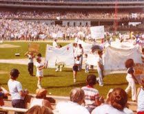
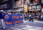
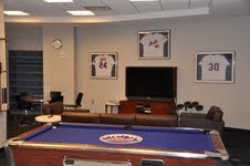
The link is amazin'! One of the best baseball photo galleries I've seen on the web. Here's two quick shots to prove Osh41's point, but click the link it's great!
Come on Charlie...does this not like 50,000 times better than anything the Mets have worn in 30 years?
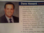
So nice...come on Dave Howard...make the change for 2011.

Is this really how you want your baseball team to look?
This will be the (probably) final complaint about the black uniforms of the decade. Here's to hoping that in 2019 black uniforms are a wonderful curiosity from the past, only worn on Old Timer's Day to welcome back the '00 NL Champs.
Orange, Blue and You, right?
If you haven't joined
The Blue Cap Army yet you should. It's free and fun.
Osh41 has defied you. Go ahead and click comments.
Main Mets Police page
Subscribe to The Mets Police by Email
Get Mets Police via reader/RSS
Follow us on twitter
@metspolice
Facebook page
Contact: shannon at metspolice.com (Guest posts welcome!)
Share Photos: pictures at metspolice.com


Post a Comment