Jesse sent over this detailed letter. Jesse, if I ever decide to retire I may have to give you the site.
1/15/10
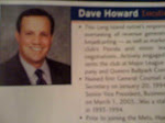
Dave Howard, VP Baseball Operations
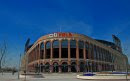
Citi Field
126th Street and Roosevelt Avenue
Flushing, New York 11368
Dear Mr. Howard,
While I assume thousands of Mets fans were happy with the news as I was, with the list of changes that are going to be made at Citi Field for the upcoming 2010 season, I wanted to list some additional changes and / or ideas that I think would make Citi Field one of the best stadiums in MLB. If some of my comments seem critical it’s only because of the desire the see the best field for my favorite team.
Where’s the Blue and Orange? - If the Mets do only one other thing to Citified for 2010, let it be to change the color of the outfield wall and change all black padding all over the stadium (like on dugout railings) to Mets blue. In the outfield, the Mets are the only team that is allowed to have orange foul poles. It would look so great if the Mets blue can go along with that orange. I can’t believe that management can think that a black outfield wall would look better than the traditional blue and orange of the team. With a black and orange outfield wall, it reeks of homage to the old New York Giants. And this isn’t just a New York National League Stadium. This is supposed to be a stadium for the New York Mets, for their fans for the decades to come, yet to remember there past at the same time. Remember we all know the Mets took the blue from the Dodgers and the orange from the Giants. But blue and orange is also the color of New York State and even the state bird is a bluebird (which for all your non bird people has orange on its breast.) The Knicks and Islanders have the same colors for their uniforms for that reason. It’s best for Mets to go back and stick to the color scheme for what they are known for.
And how come in all the ads and every promotional videos and pictures (and even a video game I saw) your new stadium before it was built had a blue outfield wall? Fans heard stories that management thought that the “blue” would look tacky in a new “classic” looking stadium. But it’s all that black that looks kind of tacky and dull and even depressing. Blue and orange is vibrant and the colors of what fans know and expect from their team.
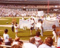
Shea Markers - I am glad that in the parking lots the bases and pitching rubber are remembered. But still more could be done. I would make it somewhat more formal and perhaps surface lights in the parking lots outlining the whole field and maybe a 410 sign where centerfield was. Maybe ground plaques showing where certain plays occurred. For example where Tommy Agee’s and Ron Swoaboa’s catches in 1969 World Series were.
Rotunda – I have no problem with the homage to Jackie Robinson as I have heard from others. It’s about a man and his great accomplishments in history. But there is no need to have it all about the Brooklyn Dodgers. In the rotunda there is no reason there cannot be a Mets presence as soon as you walk in. For example, somewhere near the ceiling, it should say, very prominently, “Home of the New York Metropolitan Baseball Club”. And there is no reason there cannot also be highlights of great New York Met moments played on those TVs in the rotunda, not just Brooklyn Dodgers highlights of Jackie Robinson; in fact even show some NY Giants highlights. I think that would make the setting more accepting to the total thought of the origins of the Mets. But it should stop there. The rest of the stadium should represent the current team and THEIR history.
And speaking of the ceiling, the rotunda is constructed of all these classic exposed beams but then you have white PVC pipe in the same area. I know its probably needs to be there for some functional reason but can’t it be covered or painted so it does not stand out so? Again this looks likes something that was not planned for or not totally thought out.
Right Field – It’s just too quirky and obviously shows of trying to look too cutesy. The outfield wall looks like it was designed with an “Etch-A-Sketch”, up and down, in and out. Just make the wall straight in right field from the bullpen area to the foul pole and you end up with more space for your Modell seating area (more seats!) It’s just a bit too silly in that area and no advantage to the home team. Make the outfield wall look like one of a professional baseball stadium, not some pinball machine layout.
Left Field - Padding in left field only needs to go up eight feet. The doubling of it looks over done. Looks like a giant black tufted sofa back there. A flat non-padded area in the upper 8 feet would be better for advertising and for championship banners.
Ads and Retired Numbers - All advertising on walls just looks kind of cramped with all the retired numbers and then the later added championship banners. Just looks like it’s been thrown together. Again visually better ideas need to be thought of.
Name of Stadium - If Citi Field name ever has to change, please no sponsor, if possible. Just make is “Shea Field” or “Metropolitan Field”
Statues and HOF- How can it be stated that ownership went to various stadiums to get ideas and not have a Hall of Fame or a statue of your most famous player(s) for your grand opening. Did they go to the stadiums like in Cincinnati and see the great Hall of Fames they have build right into the stadium? Do you see all the statues at PNC Park and St. Louis or Detroit? Right in front of Citi Field should be at least a statue of Tom Seaver. Glad changes in 2010 will have a Hall of Fame. It’s just hard for fans to understand how this was not thought out in the first place.
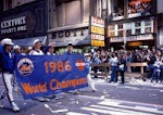
Numbers to Retire - Retire #36. Where would Mets be in there history without Koosman? Eventually Carter, Piazza, Gooden, Strawberry. And together a special place for statues of Bob Murphy, Lindsey Nelson and Ralph Kiner. Out of any player, we grew up with those personalities and voices. They were a constant in the up and downs and changes of the franchise.
Fan colors - To get some unity in the stands, Mets management should suggest fans to wear blue to Mets games and have orange towels to wave. Just how the Phillies have the white and the Steelers in NFL have the yellow terrible towels and Cardinal fans always wear red. It would give the Mets more identity and even perhaps something that could be somewhat intimidating to opposing teams
Bullpens - The bullpens, very happy they are going to be changed. Sorry to be overly critical, but what was there for 2009 looked like a dog kennel made from inexpensive material from a home improvement store. That dividing fencing of chain link fence on a new $800M stadium is beyond comprehension.
Backstop Area - This might be the 2nd thing I do and it’s a quick fix. Behind home plate, that black Citifield logo has to go and be replaced simply a full colored Mets logo. So in every TV shot, you see the Mets identification. This is so simple and in a stadium that lacks a Mets feel, it’s a simple and prominent fix.
The Bridge - It’s such a nice touch in the stadium but its sort of boring and empty. It needs perhaps some kind of change in color to bring it out. Behind the bridge on the wall there is a curvature of the same style of the bridge. This is where the naming of the bridge should be written. It’s great news to hear it will be name “Shea Bridge”.
Flag - The American flagpole has be in a more prominent area in the stadium. It’s lost where it is now. When I go to a game I now have to search for the main flag. It needs to be moved to a more center part of stadium. What about in that area to the left of the Apple to the rear of the Bob’s Furniture sign or just a flag pole put on the top, in the middle of the main scoreboard? The flagpole was in the center at Shea.
Apple - The Apple is nice but the surrounding area is kind of dull. This is the 3rd main thing that needs to be replaced. In the preseason games I saw there was like Astroturf surrounding the apple, which was OK, but then it was gone as soon as the season started and now looks like black painted plywood. (Like a floor that has carpet one day, then it was removed and then someone said “oh forget it, the plain wood sub floor is good enough”.) For a brand new stadium that simply looks awful, especially when it’s in almost every shot. Perhaps get a landscaper to get some ground cover, like ivy for the area surrounding the apple. Would look nice and would not interfere with the media screens behind the apple. Again look at other stadiums like in Pittsburgh, Philly, KC and Colorado and even a 43-year-old stadium like the Angels have. Believe me I am not asking for the stadium to look like an arboretum but its does need some park-like touches as seen in other stadiums.
Some Action - While its nice to have the apple during a homerun, something more needs to be done at those times. Maybe to the right of the left field lights on the roof (the set of lights that have the GEICO sign) a large lit up Mr. Met with a bat that would swing as soon as a HR is hit. Just the way the Liberty Bell swings at Citizen Bank Park. Maybe also on the scoreboard do a video of a loud roaring 7 train also during a HR. How cool would that be? Going to a Mets game needs to be fun again. Yes a championship caliber team helps cure all problems with the stadium, but its time to liven things up at your new field.
Curly Shuffle - Always shown before bottom of 7th. And please get rid of “Sweet Caroline”, that’s Red Sox material.
Wall of History – I have seen at other stadiums, somewhere in the stadium a wall showing yearly history of the team.
Cement Walls - Glad you are painting all the cement walls. It looked like a dungeon and even kind of creepy in some spots. I hope the one tunnel you can see right behind home plate was painted since when it rains its just shows up really bad, just water stained cement for everyone to see on TV from the outfield camera.
Main Scoreboard - Yes I know Citibank is the main sponsor. But again, look at others stadiums. Instead can’t there be a giant lighted Mets logo or even the just scripted name of team? (Look at the Phillies scoreboard). And how basic is the “Lets Go Mets” underneath? It does not even light up. Nothing. No flashing, no sounds, no lights, nothing. Just to too plain, boring and cheap looking. Citi Field needs to be classy park that pay homage to the Mets history and be fun. All can co-exist and when that happens Citi Field will indeed be one of the best parks in major league baseball.
Thanks for your time.
Sincerely,
Jesse (I deleted last name)
CC: Mets Police
Main Mets Police page
Subscribe to The Mets Police by Email
Get Mets Police via reader/RSS
Follow us on twitter
@metspolice
Facebook page
Contact: shannon at metspolice.com (Guest posts welcome!)
Share Photos: pictures at metspolice.com


Post a Comment