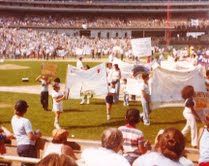
Some baseball jersey spotting around Citi Field.
Nice.

Very nice. This was a good looking jersey (the 17).
I like the idea, but I hate jerseys with weird fonts.
A black Franco #45 with a bad font. So many bad decisions rolled into one.
If you are going to go "swoosh" at least get a Mets underline jersey, not a bogus font underline short with orange underarms and a Citi Field logo on the sleeve.
If you like this sort of thing check out
this site and be sure to check out the horrrendous Bernard Gilkey jersey in the August 4th entry.
Tomorrow I will have awful caps for you.
Main Mets Police page
Follow us on twitter
@metspolice
Facebook page
send ideas/guest columns to shannon at metspolice.com


Post a Comment