Showing posts with label mets uniforms. Show all posts

Thursday, December 31, 2009

(1) Comments

Proof: New York Mets uniforms should be blue

A challenge from Osh41 who writes:


Post this and tell metspolice fans to check out the mets shots and defy them to say the uni’s now look better then they did back in the old days


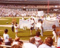
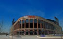
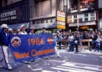
The link is amazin'!   One of the best baseball photo galleries I've seen on the web.  Here's two quick shots to prove Osh41's point, but click the link it's great!


Come on Charlie...does this not like 50,000 times better than anything the Mets have worn in 30 years?


So nice...come on Dave Howard...make the change for 2011.


Is this really how you want your baseball team to look?


This will be the (probably) final complaint about the black uniforms of the decade.  Here's to hoping that in 2019 black uniforms are a wonderful curiosity from the past, only worn on Old Timer's Day to welcome back the '00 NL Champs.  Orange, Blue and You, right?

If you haven't joined The Blue Cap Army yet you should.  It's free and fun.

Osh41 has defied you.  Go ahead and click comments.   


Main Mets Police page
Subscribe to The Mets Police by Email
Get Mets Police via reader/RSS
Follow us on twitter @metspolice
Facebook page
Contact: shannon at metspolice.com (Guest posts welcome!)
Share Photos: pictures at metspolice.com

Bookmark and Share

Monday, December 28, 2009

(1) Comments

Great photo of 1962 Mets uniform with Mets underlined

Once again it's time for "honor among bloggers."

First check out Uni Watch from where I found this link.

Then go to the link to view Casey Stengel holding up the Mets uniform in January 1962 - except note the underline (or "swoosh" as Osh41 calls it).  Who knew?  Maybe if we had known we wouldn't have hated on the swoosh jerseys so much in the 1990s.

Here's the modernish version.  

Question for the (other) black haters - would you trade underlines (and use the Casey rationalization) for no black?  I would.   Given how awful the team looks these days, this doesn't look so bad now.  At least it's blue.


Main Mets Police page
Follow us on twitter @metspolice
Facebook page
send ideas/guest columns to shannon at metspolice.com

Bookmark and Share

Saturday, November 28, 2009

(1) Comments

Times: Not Much Action At New York Mets Store On Black Friday

Oh boy, nothing ever goes right for our boys in cream and black.   I laughed when I saw Ben's name in this article because he frequently comments here on the site, and I have a sneaking suspicion that Mets Police is one of the blogs that they're talking about.   Sorry Metsies, but you do this to yourselves.  $226?  Ouch.


Published: November 28, 2009
On 42nd Street, the business on a busy shopping day clearly favored attire that celebrated a 27th World Series championship.


There were no signs, however, to announce the arrival of the new uniform tops lined up against the wall at the Mets Clubhouse store. The jerseys, which have embroidered lettering and are made with a finer material, cost $266, nearly three times the cost of other replica jerseys.

The retro jerseys sparked a debate among fans on various Mets-related blogs. Some thought the team should focus more on improving the team and less on marketing. Others thought that the jerseys were an effort to make fans feel good just as they receive their season-ticket renewal notices.
In any case, $266 was too pricey for Ben Testa, a Mets fan who stopped in the store on his way to work. Testa asked an employee how many of the new jerseys he had sold so far. None, he was told, as of midafternoon Friday.


More here.

Main Mets Police page
Follow us on twitter @metspolice
Facebook page
send ideas/guest columns to shannon at metspolice.com

Bookmark and Share

Tuesday, November 24, 2009

(9) Comments

The New 2010 New York Mets Pinstriped Uniform


So here's the new uniform.....

It looks nice.  I like the ball logo on the sleeve (please add the NY back on that, you aren't fooling anyone).

It still has dropshadow.  Why, why, why, why, why?

It's hard to judge the white/cream/off-white whatever we are calling it until we see it on a human....


Last year when the Sox introduced new caps they actually had a press event.  That's what the Mets should have done.

Back to the Mets jersey, what's that material under the armpit?

The phrasing of the release is interesting:  "The Mets will also continue to wear their white uniform at home with the black jerseys as an alternate." 

We had heard the pinless would be the prime uniform with these as a secondary.  Maybe the converse is true?  If I wanted to sell jerseys I would wear these more often than uniforms already out there.  Also unfortunately the black jerseys continue to survive.

I'm sure more info will come out throughout the day, and Uni Watch hasn't weighed in yet.

In the past I've questioned the Mets when they claimed to do research but we do know they did a uniform survey this time around, so that's good.

So for now, I like them but they could've been better.  They also could've been worse.   No word on pricing etc yet, as I said I'm sure more info will come out during the day.   I'll be wearing my now "retro" snow-white pinstriped jersey my cousin bought me.  Thanks cuz!

Update:  If you can get past the Newsday Berlin Wall, David Lennon has some information about the sales including some details about 20% off for season ticket holders.

Update #2:
NYPost_Mets 
The whites will remain the primary home uniform, with the pinstriped unis and black jerseys "in the rotation," according to the Mets.

NYPost_Mets 
I've been told by the Mets that "natural" color is a light cream similar to the '69 replica jerseys that fans were given in August.

Update #3:  Early buzz seems to be "cool but why the hell did you keep the dropshadow and the black uniforms?"  Can't say I didn't warn you Dave Howard.

Update #4:  An email from Peter, unconfirmed and Mets Police is not news (it's entertainment), take with a grain of salt as I have not confirmed this.


Shannon,
I just found out i have to visit the Citi field Store in order to get the discounts on the jersey.
20 % off the 2010 jersey plus my club mets card 15% that 35% off the jersey

The mets store on 42nd will have the jersey but not at a discounted price argg.

Lastly, i thought the jersey was going to be cream?

Update #5:
Mark Healey has left a new comment on your post "Official New Mets Uniform Announcement":

As per the usual, the Mets have taken their good intentions and fumbled them on delivery.

The decision to issue a "retro" jersey eliminates the real pinstriped uniform.

The use of the drop shadow (and continued usage of black as a team color) negates the "retro" feel of the jersey, and ensures that the black and blue hat will continue to be worn at home.

The Mets fan, desperate for anything connecting to its beloved history -- a history long-ignored and always awkward and forced relationship with ownership -- will buy this jersey.

This will ensure some sort of suit-speak comment
like, The sales figures support our decision to create synergy between the team's history and the current fan base."

The review from this Mets fan? Zero stars. If you're going to make a statement, do it right or don't do it at all. 


Update #6:
BPALM has left a new comment on your post "The New 2010 New York Mets Pinstriped Uniform":

The material under the armpit is from the cool base jersey. During the warmer months and usually all the time now jerseys are made of a material similar to the BP jerseys which have far better breathability 


Update #7.
Burt Hubbuch has posted on nypost.com including this gem:


The primary home uniform, however, will remain bright white with blue lining. Also, the alternate black home and road jerseys that appear to be unpopular with most fans are coming back.


Maybe Burt should run the team.  He gets it.

Update #8

Some speculation that the image doesn't represent what the jersey looks like.  Otherwise, Osh41 is right with his rants (he's emailing me) that there's nothing "new" about it, it's just a dirty Mets jersey.

meanwhile on twitter (and I'm re-tweeting away @metspolice if you want to follow)

NYPost_Mets 
FYI, the players' names will be on the back of the new retro uniforms.

Update #9 (1:22pm)
A fan and I are emailing, he went to the store and they were very protective of the jerseys and wouldn't show him one (you know, because the world might end if a fan saw one).    He says the cream looks "darker" than the email photo.

Here's a larger photo from Burt Hubbuch on Twitter.  Gives you a slightly better feel for it.  The dropshadow is AWFUL.  Come on guys, you blew it again.  The Mets never get it right.

Update #10...Osh41 weighs in


This is the EXACT SAME JERSEY one shade of white different than the home pins from last year. Is anyone else noticing this besides me???
This is yet another example of a half a– effort by this team, out of touch with their core fan base.
Can we have one jersey that does not have black on it? This is neither a retro jersey or a new one.
We will see the horrible blue/black hats with this and will see this new jersey about as often as we saw the pins last year. I actually got a little excited that after the he ‘acknowledgement of club history’ announcement they wouldnt screw this one up – well they did.
DITCH THE BLACK


Main Mets Police page
Follow us on twitter @metspolice
Facebook page
send ideas/guest columns to shannon at metspolice.com

Bookmark and Share

Tuesday, November 24, 2009

(0) Comments

Some Fan-Designed Alternate New York Mets Uniforms

Here's a guest post from Walter...talk about knocking it out of the park!  My thoughts at the end.


After the Twins debuted their new uniforms last week, and all the chatter about the mets making changes I decided to mess around a little. And it got out of hand…lol.
Of course some are ridiculous, but, once started I had to finish.

You’ll be happy to know I have not used any drop shadowing. I included a variety of stirrups.

·        Home:
o       Classic pins: No real changes to the pinstripes (wish they wore them more) other than color. I based the color off of the Twins new crème set, but lightened it just a bit.
o       Whites: OK, not really white anymore. I based off of San Fran’s and the Phillies shade of crème, and again lightened it a little. Modified the sleeve piping in homage to the early 80’s sleeve cuffs (pre-racing stripe), used triple piping, orange/blue/orange. I also show a variant of the pants with the same triple piping along the seams.
o       Blue home jersey: Patterned after the home whites, with Orange logo w/white border and orange piping, except the sleeve piping, used the Or/Bl/Or piping again.
o       Blue/Orange pins: Yes, looks as bad as it sounds.
o       Orange home jersey: Just to damn bright (I started an Orange/Blue pins, but had to stop)
o       Blue hat (no orange button)

·        Road:
o       Classic Road Grey: No changes other than the triple sleeve piping. Also included a triple seam piping variant on the road pants.
o       Road Blue: essentially the same as Home, but with the classic “NEW YORK”
o       Road Black: I know you hate the black, but it isn’t going away. At least I only included it for the road.
o       Orange/White border: has a way to San Fran feel (better not let the Wilpons see it)
o       Blue/Orange border: best looking of the three to me
o       Blue/White border: basically the old black road jersey without the orange as the drop shadow. Does have a bit of a Dodger feel to it (really need to keep it away from the Wilpons)
o       Blue hat
o       Black Road hat: never worn at home. I actually used the Blue w/orange logo from the two-tone hat instead of the current blue w/white border & orange drop shadow

I would have liked to have not used the Black Mets Logo sleeve patch, but, changing that is a bit beyond my current skill set.


Nice job!   As regular readers know I hate the black...but if the Mets insist on black it pairs up better with orange than blue.  At least you can see the letters if they are orange.

I like those blue alternate road jerseys (again if there must be alternates at all).  I'd even take an orange top over a black.  I worry about blue with pinstripes.

Great great job on banging these out.   Comments?

Main Mets Police page
Follow us on twitter @metspolice
Facebook page
send ideas/guest columns to shannon at metspolice.com

Bookmark and Share

Thursday, November 19, 2009

(0) Comments

Update on 2010 New York Mets Uniforms

Metsblog has the scoop on the new 2010 uniforms Note: New Home Jersey for 2010, more talk of cream colored pinstripes and the traditional (except for the dropshadow) uniforms will bite the dust.

From everything I have read the primary home uniform becomes the pinless whites, the alt is the 1969 version, the roads are the same, and horrible black uniforms still in the mix.

The report says they will be on sale on November 27th, which doesn't quite fit in with David Howard's suggestion of a December announcement.  Then again, who would be surprised if the Mets aren't communicating well.

So...the pinstriped jersey my cousin bought for me is now "retro?"

Tuesday, November 17, 2009

(0) Comments

Re-reconsidering Blue New York Mets Uniforms


A while back I mused that perhaps blue uniforms would not be a good idea because with Charlie Samuels the black-loving equipment manager involved, something horrible like this could happen.


Walter sent this in and through the magic of color we see that blue could work, like it did in 1984.  One would hope Charlie or Jeff could look at this and see why black Mets anything is horrible.

Gary looks a bit like Jimmy Buffett to me in these...combination of the stance and body.

Main Mets Police page
Follow us on twitter @metspolice
Facebook page
send ideas/guest columns to shannon at metspolice.com

Bookmark and Share

Wednesday, November 04, 2009

(2) Comments

Maybe Blue New York Mets Jerseys Are A Terrible Idea


From time to time I suggest the Mets look at blue uniforms, like the ones from the early 80's.

Here's Gary Carter in a St. Lucie Mets uniform.   Look at the mismosh  blue with Tom Glavine era black lettering, a black cap, pinstriped pants, BLACK socks.  Can you imagine the hideousness if Charlie Samuels were able to dress the New Yorkers like this?

We must never let this happen in Flushing.   Hideous mix.   Worst ever.

Main Mets Police page
Follow us on twitter @metspolice
Facebook page
send ideas/guest columns to shannon at metspolice.com

Bookmark and Share

Sunday, October 18, 2009

(2) Comments

Read Comments On Uniform Unanimity

Got a bigger reaction than I expected when I brought up how Yankees fans know what to wear to games because there aren't 50 variations.   Any time I say anything nice about the Bronx it distracts people...perhaps I should have used the Cardinals as an example.  Regardless, a good discussion:


John P has left a new comment on your post "Uniform Unanimity":

Funny, I noticed the same thing yesterday at Dodgers Stadium. Everyone was wearing blue. Looked classy and uniform! Unfortunetely, the cats out of the bag. People have bought their gear and you are never going to impose restrictions on fans.


paulsrandomstuff (http://paulsrandomstuff.wordpress.com/) has left a new comment on your post "Clearly These New York Mets Uniforms Were Better":

I want my baseball team to hustle and play smart. If they do that, I can get over it if they wear pink pajamas to the games.


Anonymous has left a new comment on your post "New York Mets Uniform Survey Part 2":

Just discovered the site and I'm thrilled, not just for the site overall, but to see so many people who want to see their team in the classy pinstriped, no-black-at-all home uniforms and the grey, no-black-at-all road uniforms!

I've been bugged by the ugly black added to the uniforms since they debuted in the '90's. Tradition is such a big part of the appeal and aura of baseball, so it's been such a disappointment to see my favorite team adopt all these dopey variations with black instead of sticking with the great classic uniforms worn when the franchise was born.


Add names to the back? Sure. Wear an all-blue, alternate jersey from time to time? Sure. But let's end the merry-go-round of endless combinations of blue hats, blue and black hats, black hats, black jerseys, etc.


The new stadium is classy - Please send the team out onto the field every game looking classy.
I am no Yankee fan, but I gotta respect the organization for this: They have a classic uniform design and they wear ONE home version and ONE road version. The team looks great every time they step on the field. That's one way the Mets should follow the Yankees.


And in the case someone from the organization does happen to read these posts, I'll end with this: The only 'Mets' apparel I've purchased in the past 10 years or so are blue caps with the orange 'NY' logo. As soon as the black is purged, I'll be ready to spend some money on a game jersey or two... maybe even some t-shirts or a jacket.


Anonymous has left a new comment on your post "Clearly These New York Mets Uniforms Were Better":

Not only should the Mets dump any and all black that appears on their uniforms, maybe the next thing to change is going back to stirrup socks and get rid of the "down past the ankles" pants.
Talk about played out! It's such a Tired look.

Those stupid looking pant style the players have worn for the last oh, decade or more looks ridiculous.

Time for a league mandate that says baseball pants are supposed to be shin to knee high...only. Like they are Supposed to be! 


kjs has left a new comment on your post "Uniform Unanimity":

Shannon---

I wish we could go all Orange and Blue with pinstripes, get rid of the black, and dump the 'gangsta variants' of 1,458 garish hat designs so that the average citizen knows the guy on the corner with the 5-inch big Mets logo on the side of his cap sells better crank than the guy in the paisley Mets cap 'round the corner, but I'd much rather see intelligent and talented players in any Mets uniform at this point.

However, I have to admit wearing my awful black-and-blue cap this fall is perfectly symbolic of the 2009 farce. 


Anonymous has left a new comment on your post "Uniform Unanimity":

Oh yeah, I'll give up my black Mike Piazza jersey I bought as a junior in HS because some blog told me to.


DyHrdMET has left a new comment on your post "Uniform Unanimity":

the Mets created this mess. Changing your look with the times is good (think back to what they wore in the late 70s and try to picture it being worn today, and the same with those 1980s jerseys which I know looked good at the time). But it creates a mishmosh. So does having many colors. The Yankees have 3 color - white, gray (road games), and their shade of dark arrogant blue, and aside from BP jerseys, they only wear one at home and one on the road. Fans really only wear the ones for home games. What do we have with the Mets (even just the current jerseys)? White, Gray (you just don't see fans wearing those much), Black, Blue, Pinstriped. It's a mess. Then you have a few different styles of Whites from their history (I don't consider vintage Seaver 1969 jerseys a bad thing at all), and if they make changes, it means more variety. Everything but the Ctii Field (security) green and maroon.


Theresa has left a new comment on your post "Uniform Unanimity":

Oh no. They also make people stay in their seats during some stupid patriotic song in Yankee Stadium. I can't stand Yankee Stadium, every baseball game is like a Nuremberg rally. Don't want to be like them. 


Joe Barone has left a new comment on your post "Uniform Unanimity":

Its retarded how they dont care what the fans do! In philly, they ALL wear red. In yankee Stadium the navy and dark blue. With us you rarely get a section at Citi Field with a Mets Cap


We can't go back in time and erase what has happened.    The underline swoosh jersey happened, but you don't see many of those.  80's era racing stripe happened, I agree it would look garish today.   Black continues to happen.


However, if the framchise would once and for all pick a look and stick to it - say like the (cough) Dodgers have (with some flip-flopping on the city name on the road, and some green unis in the 40s) - pick a look and stick with it.


Over time the fan-owned black hats will get worn away...or even become such a rarity that I will smile at your Franco t-shirt when I see it in 2044.


The Yankees sell all kinds of variants...I think that will make a nice post for this week....I never hear about merchandising problems in the Bronx.   They seem to make enough money, they just don't wear them during games.


We can look like this....


Or we can look like this.  It's up to Fred.

Main Mets Police page
Follow us on twitter @metspolice
Facebook page
send ideas/guest columns to shannon at metspolice.com

Bookmark and Share

Saturday, October 17, 2009

(3) Comments

Clearly These New York Mets Uniforms Were Better


I mentioned this briefly the other day - check out this awesome gallery of 69 Mets from Life Magazine.

Look at the shot of J.C. Martin.   Look how great that road gray looks with just blue.  Isn't that how you want your baseball team to look?


Main Mets Police page
Follow us on twitter @metspolice
Facebook page
send ideas/guest columns to shannon at metspolice.com

Bookmark and Share

Tuesday, September 29, 2009

(0) Comments

(Repost) The New York Mets Uniform Survey

We're always picking up new readers, and it occured to me that you may not have seen the uniform survey sent out by the Mets earlier this year.    So for your convenience, here it is.  Interestingly "cream" uniforms weren't part of the survey.


1.  How many tickets do you have and how do you rate youself as a fan (for example die-hard).

Page 2 asks which hat do you like better?


Page 3 asks which of these jerseys you prefer?


4.  Do you think the Mets should wear the pinstripe (home) jersey more often? Yes/No/No opinion

5.  How often should the Mets wear the pinstripe (home) jerseys?
a) All home games
b) saturday & Sunday home games
c) once per series
d) Sunday home games
e) no opinion

6.  Do you think the Mets should wear the white (home) jersey more often?  Yes/No/No opinion

7.  Do you think the Mets should keep the black jersey?  Yes/No/No opinion


8.  Slide 8 is phrased really interestingly.  I don't know if it was positioned this way because I selected NO to #7.  I have included a screen capture on the left but I doubt you can make it out.


Why do you think the Mets should not keep the black jersey?
a)  Black is not one of the Mets colors
b)  I don't like the color black
c)  Black is not part of the Mets history
d)  It doesn't look good on the field
e)  It's time for a change
f)  Other (specify)

9.  The next section will compare jerseys to see which you prefer - the one on the left, the one on the right, "I don't like either one" or no opinion.


So for me, I don't like the NY because its Yankee like but at least it isn't black - devil's choice but I stuck to my guns and said I don't like either one.


The next section of the survey is all about uniform choices.


I pick neither black.


Here I went traditional, although the one on the left is fine.


This is interesting.  It doesn't come across well here, but on the survey the one on the right looks charcoal-ish.  You may recall there was a rumor of charcoal uniforms over the spring.   These also unfortunately have black shading.   Vote left.


Since we are not the Denver Broncos I picked neither.   Either of these are better than black, but underarm colors remind me of warm up jerseys.


I went right.


16.  Should the Mets name the bridge in Center Field at Citi Field?  Yes/No/No opinion.

I find that question interesting because that too has been a topic on the blogs.   This really makes me think that the Mets are paying attention to the fans.  Maybe all this stuff works?

I assume the quiz would branch off, here - I answered yes and got the next question:

17.  What do you think the bridge should be named?
a)  Amazin' Alley (wow thats awful)
b) Casey's Crossing (corny)
c)  Gil Hodges Bridge (I like the idea but there already is a Gil Hodgers bridge)
d)  Miracle Mile Bridge (are they opening some strip malls?)
e)  Piazza Path (let's calm down with the Piazza thing, and I'd be afraid of this because, well, deep down you know)
f)  Seaver Bridge (sure)
g) Ya Gotta Believe Bridge (what, no option for Catch The Rising Stars Bridge?)
h)  Other

I went with Seaver.

18.  Do you have any other comments regarding the Mets uniforms and/or Citi Field?

Y'all can imagine what I mentioned (nicely).


Main Mets Police page
Follow us on twitter @metspolice
Facebook page
send ideas/guest columns to shannon at metspolice.com

Bookmark and Share

Tuesday, September 29, 2009

(2) Comments

NBCnewyork.com's Commentary On 2010 New York Mets Uniforms

Some good stuff here on NBCNewYork about the uniform change, including a link to a color photo of vintage Seaver.  Nothing new, but the spin is that once again the Mets tried to get something right and failed.

Why oh why would they keep the black shading?

Main Mets Police page
Follow us on twitter @metspolice
Facebook page
send ideas/guest columns to shannon at metspolice.com

Bookmark and Share

Tuesday, September 29, 2009

(1) Comments

Metsblog Story On The 2010 New York Mets Uniforms

Metsblog reports on the uniform story.....News: Mets and Egg-Shell, Pinstripes Uniform...but I think they actually have part of it incorrect by saying the retros will not have black.   I hope Cerrone is right in the end, but I will trust Paul Lukas and Uniwatch on this one - Paul emailed me that the retros will indeed have dropshadow.

The Mets Police compilation of information, while poorly written, is here.

What a great time to get rid of the black.  What possible reason could they have for keeping it?  if the idea is to sell merchandise then why not introduce something completely different like a blue jersey?


Posted using ShareThis

Tuesday, September 29, 2009

(7) Comments

Adam Rubin: Off-White Retro Home Uniforms for New York Mets in 2010 (updated)

UPDATED AGAIN:

From UniWatch:


The 2010 Mets uni info buried in the middle of this report is accurate. The related but slightly different report that ran in yesterday’s N.Y. Post is NOT accurate.

Uniwatch is as good a source as we'll get.   So, what does everyone think?

EVEN MORE UPDATED:  Paul from Uniwatch was quick to respond to an email about "black".  The "retros" do indeed have the drop shadow black.  Now we can call the Mets idiots all day.

Below is what I had posted earlier this morning, some of which is now irrelavant.

______________________________________________________

From what I am gathering from what Rubin says in today's News  and what Hubbuch said yesterday (scroll
down the site), the Mets home uniforms for 2010 will be:

Primary: white no pinstripes. The ones they wore most of the time
this season.

Alternate: an off-white pinstriped version like what was worn by the
1969 Mets at the celebration.

No word yet on how much black if any.  (as I wrote in the update - the retros have black.  The roads will be the same)

My take: I like how the retros looked. I'm happy. Will be happier if
the black leaves. (it isn't).  I prefer the pinstripes to the no-pins but I have
warmed up to the no-pins especially on civilians.

Stay tuned...

UPDATED:
Here is what Rubin said:

The Mets plan to go retro with their pinstriped home uniforms next season. Those uniforms will change to off-white, as they were in the 1960s, from their current bright white. That will also serve to differentiate the pinstriped uniforms from the solid home uniforms, which will remain the brighter white.
Read more: in the News


The debate now becomes is whether or not the uniforms were actually off-white in the 1960's.


This is what the 2009 Giants are wearing...looks creamier than the above.


This is from 2007....the "snow white"

Wednesday, September 02, 2009

(0) Comments

Bitter Bill's History Of New York Mets Uniforms

See this picture?  This is exactly why all Mets fans should insist that the Mets hire me as a consultant.

Jeff Wilpon comes into my office and says, "Hey Shannon, what do you think of this new uniform concept?"

I say, "Jeff, you know I love you, but this is why you hired me.  We will look like idiots and these will be gone in a year."

Jeff will say, "You sure?  I think they look snazzy."

"Nope.  Trust me.  This is why I am here."

Bitter Bill did a nice piece about Mets uniforms throughout the years.   Check it out.

I wonder if the Mets swoosh (underline) jerseys were because the Dodgers had underlines?.   Oh, silly question.

Main Mets Police page
Follow us on twitter @metspolice
Facebook page
send ideas/guest columns to shannon at metspolice.com

Bookmark and Share